กลุ่ม102
Creative and Environment Friendly Packaging Designs
จาก Web Design http://popsop.com/8237 แปลสรุปความโดย สิทธิรงค์ เลี้ยงถนอม รหัสนักศึกษา 5211309819 กลุ่มเรียน 102
Contact E-mail : sittirong52@gmail.com
Publish Blog :http://sittirong-arti3314
soon.blogspot.com/รายงานวิชา Arti3314 การออกแบบกราฟิกสำหรับบรรจุภัณฑ์
NEW packaging and logo for Wonder Bread
บรรจุภัณฑ์ใหม่และโลโก้ขนมปัง Wonder
While attending the International Balloon Race at the Indianapolis Speedway in 1921, as the story goes, Vice President of the Taggart Baking Company, Elmer Cline, came up with the name — which subsequently inspired the logo — of their soon-to-be-introduced loaf of bread as he was struck in wonder by the sight of the balloons in the sky.
ในขณะที่เข้าร่วมการแข่งขันบอลลูนนานาชาติที่อินเดียแนโพลิสปีดในปี 1921 เป็นเรื่องที่จะไปดำรงตำแหน่งรองประธานของ บริษัท เบเกอรี่ Taggart, เอลเมอ Cline, มาพร้อมกับชื่อ -- ซึ่งต่อมาเป็นแรงบันดาลใจโลโก้ -- ของพวกเขาทันทีเพื่อจะนำ - การผลิตขนมปังที่เขาเป็นที่หลงในสงสัยโดยสายตาของบอลลูนในท้องฟ้า

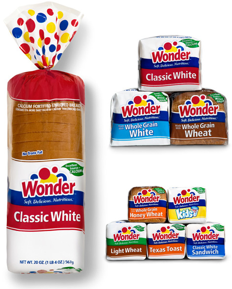
Before and After
ก่อนและหลังAnd for more than eighty years, Wonder Bread has been an icon of all things American. The company has just redesigned the complete line of packaging (with over sixty varieties of bread, buns and dinner roll products) and has modified its logo. In charge of the redesign was Kansas City-based Willoughby Design, who was been working with Wonder since the late 1990s.
และนานกว่าแปดสิบปี, ขนมปัง Wonder ได้รับไอคอนของทุกสิ่งที่ชาวอเมริกัน บริษัท ฯ ได้มีการออกแบบใหม่เพียงสายสมบูรณ์ของบรรจุภัณฑ์ (ที่มีมากกว่าหกสิบพันธุ์ของขนมปัง, ขนมปังและผลิตภัณฑ์อาหารค่ำม้วน) และมีการปรับเปลี่ยนโลโก้ของ ค่าใช้จ่ายในการออกแบบที่แคนซัสซิตี้ตามการออกแบบ Willoughby, ผู้ที่ได้รับการทำงานกับ Wonder ตั้งแต่ปลายปี 1990 คือ
Old packaging (above) compared with new (below)
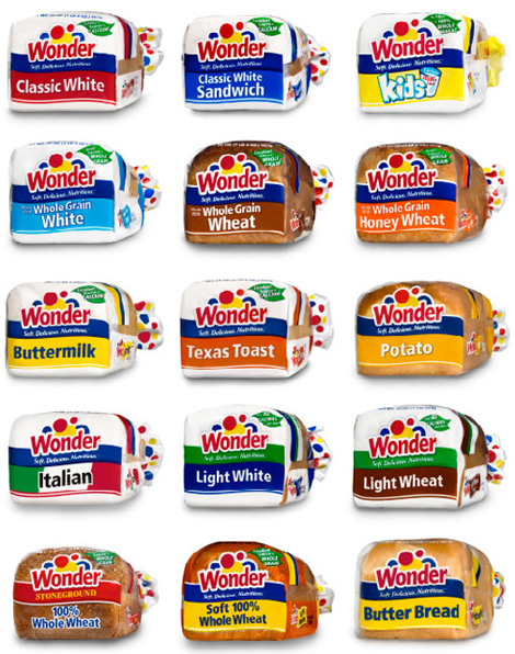
In 2008, after working through the needs of a changing market place, it was time for Wonder to evolve again for an older and more nutrition-conscious audience. Needing to recapture a #1 position in the market, Willoughby and Wonder Bread took a new look at the red, yellow and blue balloons, explored a more grown-up typeface, and dialed up the sophistication of the design system overall in order to broaden the brand’s reach to meet the growing demands of this older demographic.
— Willoughby Design
— Willoughby Design
ในปี 2008 หลังจากการทำงานผ่านความต้องการของตลาดที่มีการเปลี่ยนแปลงก็คือเวลาสำหรับการวิวัฒนาการของ Wonder อีกครั้งสำหรับการโภชนาการที่ใส่ใจผู้สูงอายุและผู้ชม ต้องไปรำลึก # 1ตำแหน่งในตลาดที่ Willoughby และขนมปัง Wonder เอารูปลักษณ์ใหม่ที่ลูกโป่งสีแดง, สีเหลืองและสีฟ้า, การสำรวจแบบอักษรมากขึ้นเติบโตขึ้นและโทรออกได้ถึงความซับซ้อนของระบบการออกแบบโดยรวมในการสั่งซื้อเพื่อขยาย การเข้าถึงแบรนด์ที่ตอบสนองความต้องการการเจริญเติบโตของประชากรที่มีอายุมากกว่านี้
-- การออกแบบ Willoughby
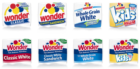
Logo: before and after
โลโก้ : ก่อนและหลัง
ไม่มีความคิดเห็น:
แสดงความคิดเห็น